Site search part 1: more top tips
Read more about optimising site search, in the first of Helen’s 2 articles on this topic...
Read more about optimising site search, in the first of Helen’s 2 articles on this topic...
 Maximise the value of a good site search feature
![]() A good search field is an important component of a website. But it’s useless to the user if the results themselves aren’t accurate, useful or user-friendly. The results can actually be as valuable a source of information for your business as analysis of the most frequently searched keywords. For example, ‘no results found’ may indicate a gap in your product offering or content.
A good search field is an important component of a website. But it’s useless to the user if the results themselves aren’t accurate, useful or user-friendly. The results can actually be as valuable a source of information for your business as analysis of the most frequently searched keywords. For example, ‘no results found’ may indicate a gap in your product offering or content.
Following on from our last article outlining best practice for the site search field, this article includes tips on optimising site search results.
Consistency and accuracy are important to encourage users to engage with the search feature. Inconsistent search results often result in a trial and error search approach, or site abandonment.
Each search result should have a:
Extraneous information, such as the time taken to wield the results displayed, should be avoided to reduce clutter and aide users in finding content of interest quickly. A tabbed layout or categorised results (as shown in the examples below) can be useful to educate users about the range of content on your site, encourage users to explore and help users to filter the results.
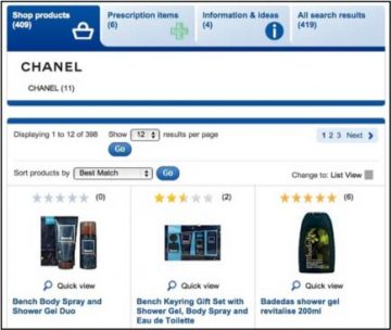 |  |
 Tip 3: Keep users’ entered terms visible on the results page
The original search term should remain within the search bar and be displayed above the results list to clarify what the results relate to. Highlighting the user’s search term within the search result description also helps the user filter the results.
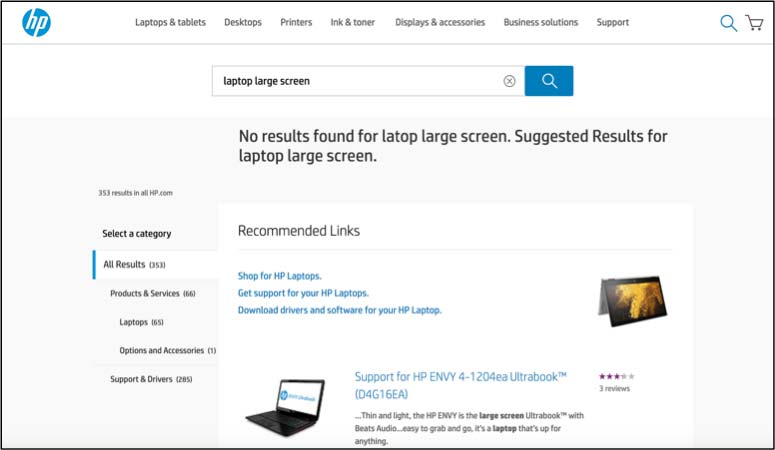
Ideally, the search functionality should be intelligent enough to recognise a potentially misspelt search term. Showing ‘related results’ that closely resemble the search term by default is recommended to help users recover from errors more quickly and/or explore further. Conversely, a ‘did you mean’ option adds an extra step whereby users must click the suggested option.
Avoid landing users on a page with no results, as this is a frustrating dead end. Instead, help users to recover by following two simple guidelines on the ‘No Results’ page.
The example below, from the HP site, shows how a typo has been corrected and the closest available results are automatically displayed.
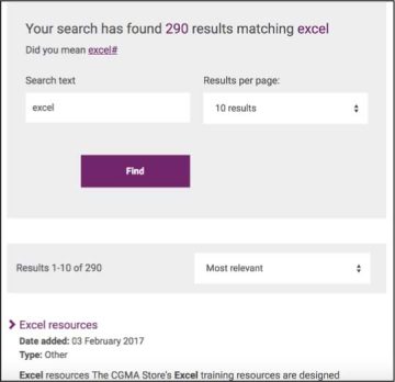
The number of matching results should be clearly shown at the top of the results page.
A pagination format at the bottom of results pages clearly tells the user how many pages are available. This information may encourage users to refine their search before scanning a long list of results.

Conversely, infinity scrolling or providing a ’view more’ button often deters users from exploring more than the initial page of results. It provides no sense of how much time it might take to explore further and this format can impede browsing if users lose their place within the results after clicking into a result and back out again.
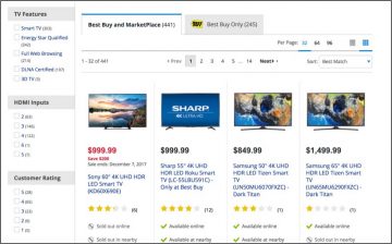 Users become overwhelmed when their search terms produce too many results to process or seemingly irrelevant results. Filtering and sorting help users to refine their search by narrowing down the data.
As shown on the Best Buy site, both options should be clearly visible, but displayed as two distinct features to reflect that filtering limits what results the user sees, whereas sorting changes the results order.
Filters are typically on the left, while sort options are usually featured in a dropdown box on the top right of the page. The sorting logic and applied filters must be obvious, with the most frequently-used options arranged first and the number of results per filter option clearly shown.
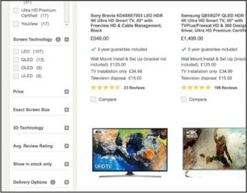 Display the options by default (rather than hidden behind a ‘Refine’ button) and limit the number of options to seven or fewer items at a time to increase likely interaction with the filter options while avoiding overwhelming users. If there are a lot of required filtering options, then collapse some categories by default and add a link to ‘view all filters’ for ease of access (like the John Lewis site).
Give users feedback that a search is underway and show them the progress level, to reassure them that their request is being actioned and to indicate how much longer they will need to wait.
We encourage you to look at our simple site search checklist with your site in mind, to benchmark your site’s search field and search results against best practice, and identify the steps you need to take to improve it. Optimising site search might just be a case of tweaking a few things to improve the user experience. Or it might be a case of improving the visibility of the search field, reworking the search functionality, or improving the results page and then testing it with target users.
Our knowledgeable and experienced UX consultants can help you at any stage of your site search or website improvement process. Please contact us if you’d like to know more.
 We can help you improve your website
Read more about optimising site search, in the first of Helen’s 2 articles on this topic...
Read more about optimising site search, in the first of Helen’s 2 articles on this topic...
5 Key takeaways from our ‘User research with kids’ user centred design event...
5 Key takeaways from our ‘User research with kids’ user centred design event...
User research doesn’t have to be expensive: learn more about Smart Usability Testing....
User research doesn’t have to be expensive: learn more about Smart Usability Testing....